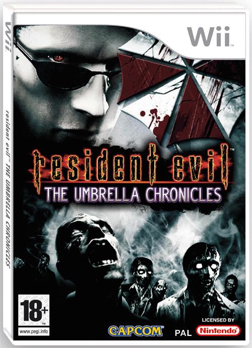
Both covers look very nice but the original cover art before the release of the official US cover looked much better with it's simple design. It simply had a picture of the bloody Umbrella logo that is shown on the US cover below the image of Wesker.
If you ask me, the Europe cover would look better without the Umbrella logo since its addition makes the top portion look too crammed. It's too close to Wesker's head.
Oh well - I have to admit that these are some of the best covers thus far for an RE game.
There have been much worse. Such as the zombie molestation cover from the NA release of REmake.

For the Europeans, I think you got your due with the PS2 Resident Evil: Code Veronica X cover.

For some strange reason, I kind of like that close up of Claire. The zombie reflection in Claire's eye is a nice touch. I guess I find it slightly enjoyable because it's something different.
EDIT: Japanese cover for Umbrella Chronicles:

(NTSC/J)
Is is just me or is it that the Japanese covers are almost ALWAYS better for most games?
*envy*


4 comments:
I agree with your conclusions about the two covers, Kevin.
The US one could have been brilliantly simple. As this is the first RE that is also targeting 'new gamers' the inclusion of Wesker is meaningless.
The European is too 'busy' as you mentioned. I can understand the inclusion of zombie horde but if there was to be any game references surely some Chris or Jill gun-posing would have been better?
Yeah, the US Umbrella Chronicles cover was very nice looking until they added that ghostly Wesker image. To me, the cover gives off the impression that Wesker is the man behind Umbrella when, most likely, he'll probably be the main person that will help to take them down.
Feast your eyes on the Japanese cover on the edited post. Must they always look superior!? They even managed to squeeze in the Umbrella logo without making it look cluttered.
And it has the gun-posing too! There's simply no doubt what the game is all about.
Resident evil kick ass
Post a Comment